ExSeqLogosAnswers
Answers to the Sequence logo exercise
Written by: Rasmus Wernersson, April 2015 (latest update: April 2018)
Q1
- The "GT" consensus site is clearly seen (completely conserved: 2 bits of information), and it appears that there is also some signal on the exon side (preference for "G" on the position before) and on the intron side.
- The intron starts at position 11 - this means that position 1-10: EXON and 11-20: INTRON.
Q2 - pretty LOGO
Q3 - frequency LOGO
Q4 - cross species comparison
![]() IMPORTANT: This question is the easiest to answer, if you compare the DONOR and ACCEPTOR site separately across the 5 species (it's simply easier to spot the differences this way)
IMPORTANT: This question is the easiest to answer, if you compare the DONOR and ACCEPTOR site separately across the 5 species (it's simply easier to spot the differences this way)
Donor sites
Observations:
- The animal (human + fruit fly) DONOR sites contain ~1 bit of information in the very last position of the exon (with a preference for "G"), and some information (< 1 bit) for the 4 positions following "GT" in the intron (=> in 6 intron positions in all)
- The plant (Arabidopsis) has the same pattern of some signal in the final 2 exon positions, but the signal in the intron is very weak after the "GT".
- The two fungal species show a pattern of next to no signal in the exon, but a very strong signal in the intron side beyond the GT.
Acceptor sites
- Overall observation: the ACCEPTOR site motif is much more alike across all 5 species compared to the DONOR sites.
- In all cases there is next to no signal on the EXON side (after the "AG") - and there is a strong preference for T and C (~1 bit, as strong as it can get for a two-letter preference) immediately before AG.
- There is a diffuse preference for Ts in the region before AG in the animals + the plant.
- This preference for Ts is clearly centered around the -9 position in the fungi.
Q5 - E. coli - Shine-Dalgano
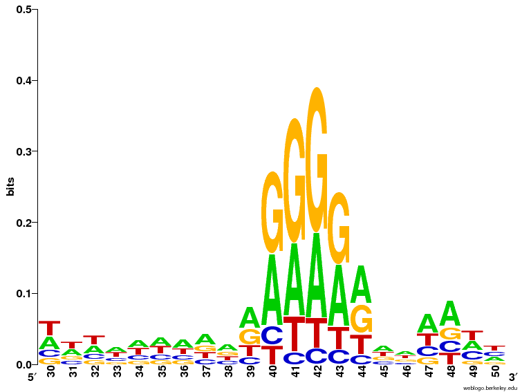
- The START codon is mostly ATG, but GTG is common enough to be seen at the first position. If you zoom in at position 51-53 it is possible to a small number of other bases also being used in rare cases.
- A region with As and Gs can been seen a position 40-44 which could potentially be part of the SD sequence.
Q6 SD zoom
The LOGO is consistent with the consensus sequence AGGAGG in the way, that it's not a huge disagreement with it. From the LOGO it appears that it's a bit of a stretch to claim A over G in any of the positions, but a clear overrepresentation of As OR Gs is clearly seen.
Q7 - Kozak sequence (Yeast)

There appears to be a weak signal in the positions immediately before the START codon (especially the -3 position = coordinate 48).
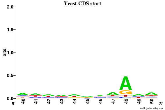
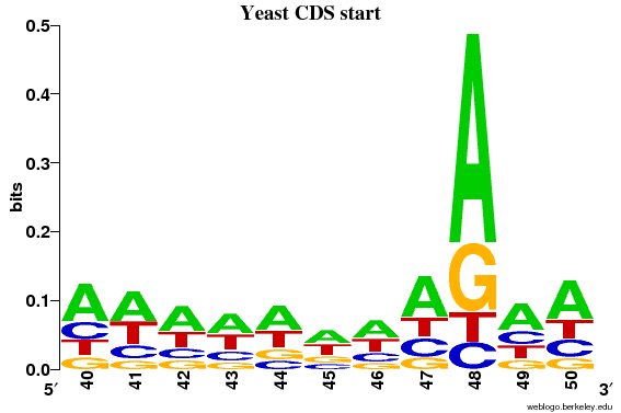
It can now clearly be seen that only position 48 (= 3 before the ATG) has information content above 0.2 bits.
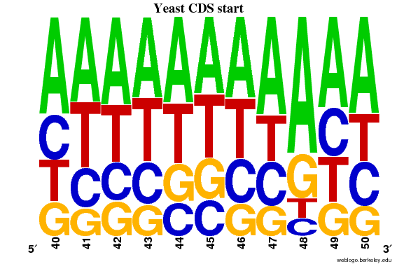
By plotting a frequency plot of the same region, it can be seen that >50% of the sequences have A in position 48.
Q8 - Signal peptides comparison
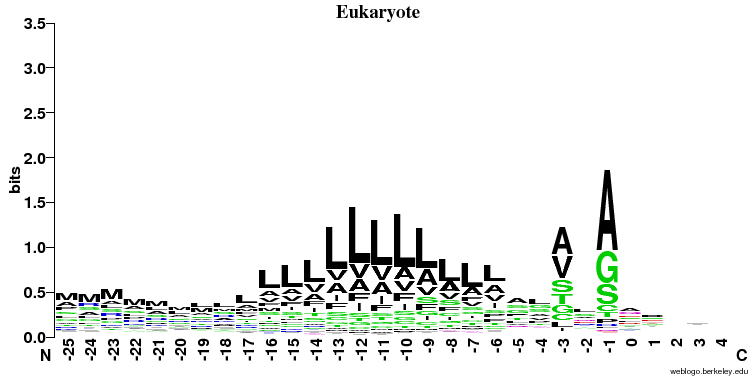
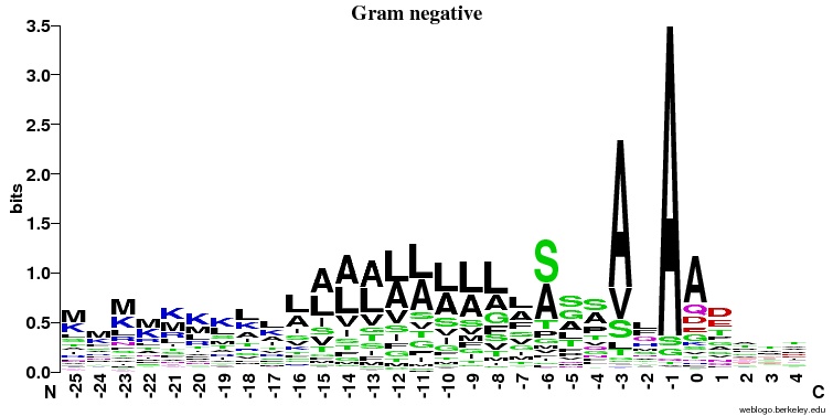
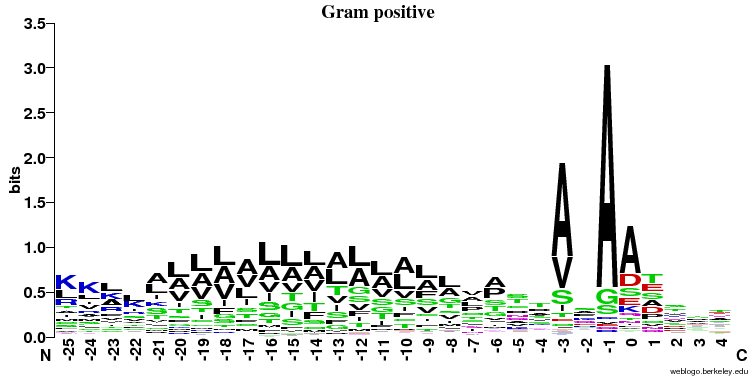
- Similarities:
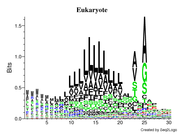
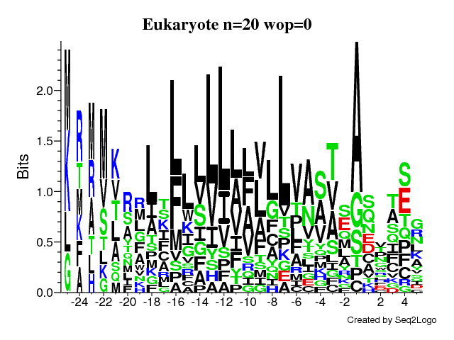
- It's clearly seen that position -1 (just before the cleavage) and -3 is important and A (alanine) is preferred here (especially in the prokaryotes).
- In all three cases there is a stretch of hydrophobic (color = black) amino acids (L, V, A, I) in the middle of the signal peptide.
- Differences:
- The preference for A (alanine) at the -1 position is much stronger in the prokaryotic sequences
- The hydrophobic stretch is longer in Gram positive bacteria
- There is a preference for S/A at position -6 in Gram negatives that is not seen elsewhere
- There is no signal after the cleavage site in eukaryotes and some signal in the first few positions in both prokaryotic groups
Q9 - seq2logo
- Yes - it clearly shows the same overall motif as above. Note that, unlike WebLogo, Seq2logo indicates positions with gaps by making the stack of letters more narrow.
Q10 - small data sets
![]() IMPORTANT: Compare the LOGOs from the small data set to the LOGO we got from the large data set (Question 9+10) and investigate if you can see the same pattern.
IMPORTANT: Compare the LOGOs from the small data set to the LOGO we got from the large data set (Question 9+10) and investigate if you can see the same pattern.
- The first plot (without pseudo-counts) is very noisy, and only the very overall trends can be seen: the tendency to have an "A" at the -1 position and a somewhat diffuse hydrophobic region.
- In the second plot (with the pseudo-counts) the picture looks a lot more like what we saw in the big data sets: a specific pattern at the -1 and -3 positions and the hydrophobic region much more in the shape with what we saw before.


