In this course you will learn applied computational precision
medicine, meaning that you will learn to do analyses in R similar to
those done in clinical settings all over the world. This means that we
will be busy with hands on data analysis and have limited time for long
theoretical presentations. Rather, I will provide you with excellent
online materials (a mix of readings and videos) explaining the methods
we will use that you are required to go through on your own.
Please make sure you go read/watch the materials - I
will not go through them in class. If you are unsure
about aspects of what you read/watch, you are highly
encouraged to seek additional info online. You will then discuss the
materials in groups and I will answer any remaining questions you may
have before we proceed to the fun part: the exercises where you will
learn to apply them. This way we can invest as much of the course as
possible training you to apply these tools to real life data.
For the computer exercises we will be using R to process, analyze, and visualize data. R is Open Source and freely available for Windows, Mac and Linux. We will be utilizing a RStudio server cloud solution to make sure that everyone uses the same version of R and the needed packages. You can log in with your DTU credentials here.
NOTE: In order to produce plots with RStudio server, you need
to have the appropriate graphics device activated. If you have X11
installed, this should work without any further actions. If you do not,
you will get an error whenever you try to plot anything. To mitigate
this, open Rstudio server, go to “Tools” (options bar at the top of the
screen), select “Global options” from the drop down menu, select the
“Graphics” tab, and change “Backend” to “Cairo”.
When: September 3, 13.00-17.00
Where: Building 210, room 142/148
What: Lecture and self study
When: September 10, 13.00-17.00
Where: Building 210, room 142/148
What: Q&A, exercises, and self study
Data
For this exercise, you will work with data from the
cancer genome atlas (TCGA) processed by the kind people behind the Xena
browser. You can explore a bit here (we have downloaded the data and
wrangled it a bit for the exercises)
RNA-seq
based expression data for glioblastoma multiforme (TCGA
data)
Exercises
#### Course 22123: Computational precision medicine
#### Day 2 practical: working with gene expression data in R
#### By Lars Ronn Olsen
#### 09/09/2024
#### Technical University of Denmark

## Load necessary packages (you can back fill once you know what packages you will use)
library(ggplot2)


## Load the expression and phenotype data
load("/home/projects/22123/ex2.Rdata")

## You will find 3 data objects saved in this Rdata file:
## gbm_counts - the raw counts of reads mapping to each gene
## gbm_fpkm - the gene length and library size normalized counts for each gene
## gbm_pheno - a lot of data pertaining to the samples
## All three objects have been downloaded from the Xenabrowser and then wrangled a bit to make it easier to work with

## Check out the distribution of the expression in gbm_counts. Just for a sample or two. What kind of distribution are you looking at?


## Check out the distribution of the expression in gbm_fpkm. Also just for a sample or two. What changed? Why should we transform the raw counts when visualizing data?


## Take a closer look at the gbm_phenotype. Specifically the column called "sample_type.samples" and read here: https://gdc.cancer.gov/resources-tcga-users/tcga-code-tables/sample-type-codes


## Take a closer look at the column called "batch_number" and read here: https://gdc.cancer.gov/resources-tcga-users/tcga-code-tables/bcr-batch-codes (you only need to look at the first portion of the batch code)


## Calculate PCA on count matrix
## Why did this not work? You might need to ask Google or chatGPT


## Solve the problem and try again


## Check out how much variance is explained
## Is this more or less than you would expect/hope for?


## Plot the first two principal components of the PCA


## Now try the same with FPKM transformed data
## Do you get the same results in terms of variance explained and visualization of PC1 and PC2? Why/why not? Which do you think is better to use?


## Plot PCA of FPKM and color by batch
## Do you anticipate batch effects in this dataset?


## Plot PCA and color by sample type
## How does this look?#### Course 22123: Computational precision medicine
#### Day 2 practical: working with gene expression data in R
#### By Lars Ronn Olsen
#### 09/09/2024
#### Technical University of Denmark
## Load necessary packages (you can back fill once you know what packages you will use)
library(ggplot2)
## Load the expression and phenotype data
load("/home/projects/22123/ex2.Rdata")
## You will find 3 data objects saved in this Rdata file:
## gbm_counts - the raw counts of reads mapping to each gene
## gbm_fpkm - the gene length and library size normalized counts for each gene
## gbm_pheno - a lot of data pertaining to the samples
## All three objects have been downloaded from the Xenabrowser and then wrangled a bit to make it easier to work with
## Check out the distribution of the expression in gbm_counts. Just for a sample or two. What kind of distribution are you looking at?
df <- data.frame(sample = gbm_counts[,1])
ggplot(df, aes(x = sample)) +
geom_density()
## Check out the distribution of the expression in gbm_fpkm. Also just for a sample or two. What changed? Why should we transform the raw counts when visualizing data?
df <- data.frame(sample = gbm_fpkm[,1])
ggplot(df, aes(x = sample)) +
geom_density()
## Take a closer look at the gbm_phenotype. Specifically the column called "sample_type.samples" and read here: https://gdc.cancer.gov/resources-tcga-users/tcga-code-tables/sample-type-codes
table(gbm_pheno$sample_type.samples)
## Take a closer look at the column called "batch_number" and read here: https://gdc.cancer.gov/resources-tcga-users/tcga-code-tables/bcr-batch-codes (you only need to look at the first portion of the batch code)
table(gbm_pheno$batch_number)
## Calculate PCA on count matrix
pca_count <- prcomp(t(gbm_counts), scale. = TRUE)
## Why did this not work? You might need to ask Google or chatGPT
## Solve the problem and try again
gbm_counts <- gbm_counts[rowSums(gbm_counts) > 0,]
pca_count <- prcomp(t(gbm_counts), scale. = TRUE)
## Check out how much variance is explained
summary(pca_count)
## Is this more or less than you would expect/hope for?
## Plot the first two principal components of the PCA
df <- data.frame(PC1 = pca_count$x[,1], PC2 = pca_count$x[,2])
ggplot(df, aes(x = PC1, y = PC2)) +
geom_point()
## Now try the same with FPKM transformed data
gbm_fpkm <- gbm_fpkm[rowSums(gbm_fpkm) > 0,]
pca_fpkm <- prcomp(t(gbm_fpkm), scale. = TRUE)
summary(pca_fpkm)
df <- data.frame(PC1 = pca_fpkm$x[,1], PC2 = pca_fpkm$x[,2])
ggplot(df, aes(x = PC1, y = PC2)) +
geom_point()
## Do you get the same results in terms of variance explained and visualization of PC1 and PC2? Why/why not? Which do you think is better to use?
## Plot PCA of FPKM and color by batch
df <- data.frame(PC1 = pca_fpkm$x[,1], PC2 = pca_fpkm$x[,2], batch = gbm_pheno[match(colnames(gbm_fpkm), gbm_pheno$submitter_id.samples),]$batch_number)
ggplot(df, aes(x = PC1, y = PC2, color = batch)) +
geom_point()
## Do you anticipate batch effects in this dataset?
## Plot PCA and color by sample type
df <- data.frame(PC1 = pca_fpkm$x[,1], PC2 = pca_fpkm$x[,2], type = gbm_pheno[match(colnames(gbm_fpkm), gbm_pheno$submitter_id.samples),]$sample_type.samples)
ggplot(df, aes(x = PC1, y = PC2, color = type)) +
geom_point()
## How does this look?When: September 17, 13.00-17.00
Where: Building 210, room 142/148
What: Q&A, exercises, and self study
#### Course 22123: Computational precision medicine
#### Day 3 practical: Differential gene expression analysis and gene set enrichment analysis
#### By Puck Quarles van Ufford
#### 09/09/2024
#### Technical University of Denmark

## In this exercise, we will analyse data from patients with colon cancer in the TCGA. We will compare patients who did and did not survive.

## Load necessary packages (
library(tidyverse)
library(DESeq2)
library(fgsea)
library(msigdbr)

## Load the data for this week's exercises
load("/home/projects/22123/ex3.Rdata")

## Have a look at the two objects in the data and see if you understand what they are.
## What is the difference between long and wide data and how is the counts data represented?
## In the survival data object, what do the columns represent? Maybe Google around a bit to find out (or ask ChatGPT perhaps)

## Filter the counts data and the survival data so it only has overlapping samples


## Convert the counts data to a matrix, where the rownames are genes and the column names are samples


## For the survival data, convert the rownames to sample names


## Make sure column names in the counts matrix are in the same order as the rownames in the survival data


## Create a DESeq data set using overall survival (OS) for the design


## Run DESeq2 on the DESeq data set and look at the results (this make take few minutes, so go and get a coffee)


## Convert the results to a data frame and add a column indicating if the results is significant or not


## Create a volcano plot with ggplot (optional: play around here a bit with colors and themes to improve the readability of your plot)


## Prepare a list of ranked genes by extracting the column with "stat" changes from the DESeq2 results and name the list with the gene IDs


## Remove missing values from the ranked gene list


## Load the GO term category (called "C5") and biological process subcategory (called "BP") from MSigDB for human genes and get a list of gene symbols for each gene set


## Run fgsea using the gene sets as pathways and the ranked list of genes as stats


## Create a bar plot showing the normalized enrichment scores of the top 5 most enriched significant pathways #### Course 22123: Computational precision medicine
#### Day 3 practical: Differential gene expression analysis and gene set enrichment analysis
#### By Puck Quarles van Ufford
#### 09/09/2024
#### Technical University of Denmark
## In this exercise, we will analyse data from patients with colon cancer in the TCGA. We will compare patients who did and did not survive.
## Load necessary packages
library(tidyverse)
library(DESeq2)
library(fgsea)
library(msigdbr)
## Load the data for this week's exercises
load("/home/projects/22123/ex3.Rdata")
## Have a look at the two objects in the data and see if you understand what they are.
## What is the difference between long and wide data and how is the counts data represented?
## In the survival data object, what do the columns represent? Maybe Google around a bit to find out (or ask ChatGPT perhaps)
## Filter the counts data and the survival data so it only has overlapping samples
counts_samples <- unique(COAD_counts$sample)
surv_samples <- surv$sample
overlapping_samples <- intersect(counts_samples, surv_samples)
COAD_counts_filtered <- filter(COAD_counts, sample %in% overlapping_samples)
surv_filtered <- filter(surv, sample %in% overlapping_samples)
## Convert the counts data to a matrix, where the rownames are genes and the column names are samples
COAD_counts_matrix <- COAD_counts_filtered |>
pivot_wider(names_from = sample,
values_from = count) |>
column_to_rownames("gene")
## For the survival data, convert the rownames to sample names
surv_filtered <- column_to_rownames(surv_filtered, "sample")
## Make sure column names in the counts matrix are in the same order as the rownames in the survival data
surv_filtered <- surv_filtered[overlapping_samples,]
COAD_counts_matrix <- COAD_counts_matrix[, overlapping_samples,]
## Create a DESeq data set using overall survival (OS) for the design
dds <- DESeqDataSetFromMatrix(countData = COAD_counts_matrix,
colData = surv_filtered,
design = ~ OS)
## Run DESeq2 on the DESeq data set and look at the results (this make take few minutes, so go and get a coffee)
dds <- DESeq(dds)
res <- results(dds)
## Convert the results to a data frame and add a column indicating if the results is significant or not
res_df <- as_data_frame(res) |>
mutate(significant = padj < 0.05)
## Create a volcano plot with ggplot (optional: play around here a bit with colors and themes to improve the readability of your plot)
ggplot(res_df,
mapping = aes(x = log2FoldChange,
y = -log10(padj),
color = significant)) +
geom_point() +
scale_color_manual(values = c("grey", "red")) +
labs(x = "Log2 Fold Change",
y = "-Log10 Adjusted P-value",
title = "Volcano Plot") +
theme_minimal()
## Prepare a list of ranked genes by extracting the column with "stat" changes from the DESeq2 results and name the list with the gene IDs
ranked_genes <- res$stat
names(ranked_genes) <- rownames(res)
## Remove missing values from the ranked gene list
ranked_genes <- ranked_genes[!is.na(ranked_genes)]
## Load the GO term category (called "C5") and biological process subcategory (called "BP") from MSigDB for human genes and get a list of gene symbols for each gene set
gene_sets <- msigdbr(species = "Homo sapiens", category = "C5", subcategory = "BP")
gene_sets <- split(x = gene_sets$gene_symbol, f = gene_sets$gs_name)
## Run fgsea using the gene sets as pathways and the ranked list of genes as stats
fgsea_res <- fgsea(pathways = gene_sets,
stats = ranked_genes)
## Create a bar plot showing the normalized enrichment scores of the top 5 most enriched significant pathways
topPathways <- fgsea_res |>
dplyr::arrange(padj) |>
dplyr::slice(1:5)
ggplot(topPathways,
mapping = aes(x = reorder(pathway, NES),
y = NES)) +
geom_col() +
coord_flip() +
labs(x = "Pathway",
y = "Normalized Enrichment Score (NES)",
title = "Top 10 Enriched Pathways") +
theme_minimal()Multiple choice quiz for todays curriculum. NOTE
This is a subset of what you need to know about these topics.
It is not a comprehensive list of what you need to know!
When: September 24, 13.00-17.00
Where: Building 210, room 142/148
What: Q&A, exercises, and self study
Data
Today we will be working with microarray gene
expression data for cancer subtyping. These data were generate by
researchers at the “Cartes d’Identité des Tumeurs program” (CIT) in
Paris. They used the microarrays to generate expression data from 355
breast cancer patients. They then used 245 genes to divide the patients
into 6 strata, with different clinical characteristics. The file
“ex4.Rdata” contains the following five objects:
CIT_full
contains microarray expression of all genes for all samples
CIT_subtyping contains microarray expression of 245 subtyping
genes for all samples
CIT_class contains the subtypes for all
355 samples
CIT_genesets contains genes upregulated in each
subtype
Bordet_RNA_tpm you will not need this object until
next week
You can read more about the data set here
Exercise
#### Course 22123: Computational precision medicine
#### Day 4 practical: clustering and feature selection for molecular subtyping
#### By Lars Ronn Olsen
#### 06/06/2023
#### Technical University of Denmark

## Load necessary packages
library(ggplot2)
library(e1071)
library(class)
library(GSVA)

## Load exercise data
load("/home/projects/22123/ex4.Rdata")


## Check out the distribution of the expression of a sample or two in CIT_full (or all)


# Does it look different from RNA-seq? How? Why?


## Do a leave-one-out classification of CIT subtyping cohort using distance to centroid (DTC)
# For the classifications, with DTC and kNN you should use CIT_subtyping, for ssGSEA you should use CIT_full. Why?
# You can do this however you would like, but here is how I would approach it in base:

# make empty prediction vector

# loop over samples (columns)

  # make a training matrix consisting of all samples but the one you leave out

  # remove that samples class from the class vector

  # make a test vector consisting of only that sample

  # get the class of that sample

  # make an empty centroid matrix

  # loop over each of the six classes

    # for each of these classes, subset the training matrix to samples belonging to that class, and calculate the mean expression of each probe in the class

    # add the mean vector to the centroids matrix

  # add colnames to the centroid matrix

  # calculate the distance of the test sample to the centroids

  # assign the class of the closest centroid

  # check if you got it right and make a logical vector

# check how many of the cases you got it right


# Does DTC classification work?


## Do a leave-one-out classification of CIT subtyping cohort using kNN with the e1071 package (get some inspiration from the results if you have not worked with this package before)

# decide on a k (you could try 5 for a start)

# make empty prediction vector

# loop over all samples


# check how many of the cases you got it right


# Does kNN classification work? Maybe try another k?


## Do a classification of CIT training samples using ssGSEA (NOTE: you should use the CIT_full for this - why?)#### Course 22123: Computational precision medicine
#### Day 4 practical: clustering and feature selection for molecular subtyping
#### By Lars Ronn Olsen
#### 06/06/2023
#### Technical University of Denmark
## Load necessary packages
library(ggplot2)
library(e1071)
library(class)
library(GSVA)
## Load expression data
load("/home/projects/22123/ex4.Rdata")
## Check out the distribution of the expression of a sample or two (or all)
df <- data.frame(microarray = CIT_full[,1])
ggplot(df, aes(x = microarray)) +
geom_density()
# Does it look different from RNA-seq? How? Why?
# Microarray data is largely normally distributed, while RNA seq (counts) follows a negative binomial distribution.
## Do a leave-one-out classification of CIT subtyping cohort using distance to centroid (DTC)
# make empty prediction vector
pred_vector <- c()
# loop over samples (columns)
for(i in 1:ncol(CIT_subtyping)) {
# make a training matrix consisting of all samples but the one you leave out
training <- CIT_subtyping[,-i]
# remove that samples class from the class vector
training_classes <- CIT_classes[-i]
# make a test vector consisting of only that sample
test <- CIT_subtyping[,i]
# get the class of that sample
test_class <- CIT_classes[i]
# make an empty centroid matrix
centroids <- NULL
# loop over each of the six classes
for (class in unique(CIT_classes)) {
# for each of these classes, subset the training matrix to samples belonging to that class, and calculate the mean expression of each probe in the class
class_centroid <- rowMeans(training[,training_classes==class])
# add the mean vector to the centroids matrix
centroids <- cbind(centroids, class_centroid)
}
# add colnames to the centroid matrix
colnames(centroids) <- unique(CIT_classes)
# calculate the distance of the test sample to the centroids
d <- as.matrix(dist(t(cbind(centroids, test))))
# assign the class of the closest centroid
class_pred <- names(which.min(d[1:6,7]))
# check if you got it right and make a logical vector
pred_vector <- c(pred_vector, test_class==class_pred)
}
# check how many of the cases you got it right
table(pred_vector)
# Does DTC classification work?
## Do a leave-one-out classification of CIT subtyping cohort using kNN
# decide on a k (you could try 5 for a start)
k <- 5
# make empty prediction vector
knn_pred <- c()
# loop over all samples
for(i in 1:ncol(CIT_subtyping)) {
knn_pred <- c(knn_pred, as.vector(knn(train = t(CIT_subtyping[,-i]), test = CIT_subtyping[,i], cl = as.factor(CIT_classes[-i]), k = k)))
}
# check how many of the cases you got it right
table(knn_pred==CIT_classes)
# Does kNN classification work? Maybe try another k?
## Do a classification of CIT training samples using ssGSEA (NOTE: you should use the CIT_full for this)
ssGSEA_enrichments <- gsva(expr = CIT_full, gset.idx.list = CIT_genesets, method = "ssgsea")
ssGSEA_pred <- apply(ssGSEA_enrichments, 2, which.max)
ssGSEA_pred <- rownames(ssGSEA_enrichments)[ssGSEA_pred]
table(ssGSEA_pred==CIT_classes)Paper
describing how to make RNA seq backwards compatible with microarray
data
Paper
describing prediction of tumour purity and stromal and immune cell
admixture from expression data
Paper
describing bioinformatics pipelines for molecular subtyping of
cancer - This is same paper as last week, but re-read with a
focus on the n+1 sample integration approach and think about why we did
it differently in this paper than we did in the paper above, where we
used the tool called ComBat. You will need to consult Supplementary
Figure 4 (see under “Additional Information”). Also focus on the effects
of tumor purity. See Supplementary Figure 1
Tumor
microenvironment and tumor heterogeneity (read introduction, review the
video and Figure 1)
Your turn! Find resources about the
following concepts:
* Kendall Tau distance between ranked
vectors
* How to apply the ESTIMATE algorithm using the “immunedeconv”
package
When: October 1, 13.00-17.00
Where: Building 210, room 142/148
What: Q&A, exercises, and self study
Data
Today we will be working with RNA sequencing gene
expression data for cancer subtyping. These data were generate by
researchers at the “The Institut Jules Bordet” in Anderlecht They used
RNA sequencing to generate expression data from 41 breast cancer
patients. The file “ex5.Rdata” contains the following five objects:
CIT_full contains microarray expression of all genes for all
samples, quantified using the Affymetrix HG-U133 Plus 2.0 microarray
CIT_subtyping contains microarray expression of 245 subtyping
genes for all samples
CIT_classes contains the subtypes for
all 355 samples
Bordet_microarray contains gene expression
quantified using the Affymetrix HG-U133 Plus 2.0 microarray
Bordet_reference_mapped_tpm contains gene expression quantified
by mapping reads to a reference transcriptome
Bordet_probe_mapped_tpm contains gene expression quantified by
mapping reads to the probe sequences of the Affymetrix HG-U133 Plus 2.0
microarray
You can read more about the Bordet data set here
Exercise
#### Course 22123: Computational precision medicine
#### Day 5 practical: clustering and feature selection for molecular subtyping
#### By Lars Ronn Olsen
#### 01/10/2024
#### Technical University of Denmark

## Load necessary packages
library(limma)
library(immunedeconv)
library(rankdist)
library(ggplot2)

## Load the data for this week's exercises
load("/home/projects/22123/ex5.Rdata")

## First, we will look into the effects of technical variance on subtyping. One source of technical variance is when samples are processed in different labs, another source is when expression is quantified using different technologies. Today we will compare microarray data with RNA sequencing data generated at different labs.

## Use the DTC classifier from last week to classify the *microarray* data generated at the Bordet institute based on the CIT training data.
## Q: what do you observe here? Are the results believable?

## Co-visualize the training data (CIT) with the test data (Bordet microarray) in a PCA plot. Use only the subtyping genes.
## Q: what do you see? Does this visualization agree with your analysis above?

## Now repeat the classification and visualization with the *microarray* data generated at the Bordet institut, only this time transform each sample to gene expression ranks. Remember to do the same for the training data, and remember to use the appropriate distance metric
## Q: what do you observe here? Are the results different from above?
## Q: we don't know what subtypes the new samples are, so we cannot evaluate performance against a "ground truth". Can you think of a way to evaluate whether the new samples are comparable to the training data? Hint: what are their distance to the centroids compared to the training data samples?

## Now use the DTC classifier to classify the *reference mapped* RNA sequencing data generated at the Bordet institute.
## Q: what do you observe here? Are the results believable?
## Q: we don't know what subtypes the new samples are, so we cannot evaluate performance against a "ground truth". Can you think of a way to detect outliers in the new samples compared with the training data? Hint: what are their distance to the centroids compared to the training data samples?

## Co-visualize the training data (CIT) with the test data (Bordet reference mapped) in a PCA plot. Use only the subtyping genes.
## Q: what do you see? Does this visualization agree with your analysis above?

## Now repeat the classification, outlier detection, and visualization with the *probe-mapped* RNA sequencing data generated at the Bordet institute.
## Q: does this work? Why / why not?

## Lastly, repeat the classification, outlier detection, and visualization with *rank transformed probe-mapped* RNA sequencing data generated at the Bordet institute
## Q: does this work? Why / why not?

## Now we will switch gears from cross-platform integration, to looking into the effects of tumor purity
## For this we will use the algorithm, ESTIMATE, as implemented in the "immunedeconv" package

## Run ESTIMATE on the CIT samples (remember to use the full gene expression matrix)
## Q: why do I ask you to use the full gene expression matrix?
## Q: do the subtypes differ in their purity?

## Now use the removeBatchEffect() function from the limma package to adjust the CIT training gene expression values for purity (you can adjust the subtyping genes only). This normalizes the samples to the gene expression levels they would have if they all had the exact same purity
## Try to do some simple visualizations of the effects ESTIMATE has on the expression. E.g. plot the correlation between adjusted vs non-adjusted gene expression values in a random sample.
## Q: what happened?

## Use the DTC classifier to classify the purity adjusted samples (use rank transformed expression values)
## Q: what happened? Did any samples shift subtype? Why do you think this is?

## Take a moment to think deeply about what purity means for a sample.
## Q: are all the non-tumor cells in the sample irrelevant, or could they mean something in terms of patient survival therapy response?
## Q: should classification always be done on purity adjusted samples in your opinion?#### Course 22123: Computational precision medicine
#### Day 5 practical: clustering and feature selection for molecular subtyping
#### By Lars Ronn Olsen
#### 01/10/2024
#### Technical University of Denmark
## Load necessary packages
library(limma)
library(immunedeconv)
library(rankdist)
library(ggplot2)
## Load the data for this week's exercises
load("/home/projects/22123/ex5.Rdata")
## First, we will look into the effects of technical variance on subtyping. One source of technical variance is when samples are processed in different labs, another source is when expression is quantified using different technologies. Today we will compare microarray data with RNA sequencing data generated at different labs.
## Use the DTC classifier from last week to classify the *microarray* data generated at the Bordet institute based on the CIT training data.
# Subset the Bordet microarray data and the CIT subtyping data to the overlapping genes, order them
Bordet_microarray_subtyping <- Bordet_microarray[rownames(Bordet_microarray) %in% rownames(CIT_subtyping),]
Bordet_microarray_subtyping <- Bordet_microarray_subtyping[order(rownames(Bordet_microarray_subtyping)),]
CIT_subtyping_2 <- CIT_subtyping[rownames(CIT_subtyping) %in% rownames(Bordet_microarray_subtyping),]
CIT_subtyping_2 <- CIT_subtyping_2[order(rownames(CIT_subtyping_2)),]
# Calculate the centroids
centroids <- NULL
# loop over each of the six classes
for (class in unique(CIT_classes)) {
# for each of these classes, subset the training matrix to samples belonging to that class, and calculate the mean expression of each gene in the class
class_centroid <- rowMeans(CIT_subtyping_2[,CIT_classes==class])
# add the mean vector to the centroids matrix
centroids <- cbind(centroids, class_centroid)
}
# add colnames to the centroid matrix
colnames(centroids) <- unique(CIT_classes)
# calculate distances
d <- as.matrix(dist(t(cbind(centroids, Bordet_microarray_subtyping))))
# subset to the Bordet samples in the rows, and the centroids in the columns
d <- d[7:nrow(d), 1:6]
# determine classes
Bordet_subtypes <- apply(d, 1, which.min)
Bordet_subtypes <- colnames(d)[Bordet_subtypes]
## Q: what do you observe here? Are the results believable?
table(Bordet_subtypes)
# Could be OK, but maybe a bit surprising that there is only 1 LumA and 1 LumB
## Co-visualize the training data (CIT) with the test data (Bordet microarray) in a PCA plot. Use only the subtyping genes.
pca <- prcomp(t(cbind(CIT_subtyping_2, Bordet_microarray_subtyping)), scale. = TRUE)
df <- data.frame(PC1 = pca$x[,1], PC2 = pca$x[,2], subtype = c(CIT_classes, Bordet_subtypes), dataset = c(rep("CIT", length(CIT_classes)), rep("Bordet", length(Bordet_subtypes))))
ggplot(df, aes(x = PC1, y = PC2, color = subtype, shape = dataset)) +
geom_point()
ggplot(df, aes(x = PC1, y = PC2, color = dataset)) +
geom_point()
## Q: what do you see? Does this visualization agree with your analysis above?
# I see that the Bordet samples appear to be located somewhat above the CIT samples. This indicates that PC2 likely captures technical variation. This also explains the very few LumA and LumB classifications, since these are at the bottom of the PC plot
## Now repeat the classification and visualization with the *microarray* data generated at the Bordet institut, only this time transform each sample to gene expression ranks. Remember to do the same for the training data, and remember to use the appropriate distance metric
# Rank the centroids, the Bordet data, and the CIT data
centroids_rank <- apply(centroids, 2, rank)
Bordet_microarray_subtyping_rank <- apply(Bordet_microarray_subtyping, 2, rank)
CIT_subtyping_2_rank <- apply(CIT_subtyping_2, 2, rank)
# Repeat the DTC classification, but this time using Kendall's Tau distance
d <- t(apply(X = Bordet_microarray_subtyping_rank, MARGIN = 2, FUN = function(x) DistanceBlock(mat = t(centroids_rank), r = x)))
colnames(d) <- colnames(centroids_rank)
Bordet_subtypes_rank <- apply(d, 1, which.min)
Bordet_subtypes_rank <- colnames(d)[Bordet_subtypes_rank]
# Visualize
## Co-visualize the training data (CIT) with the test data (Bordet microarray) in a PCA plot. Use only the subtyping genes.
pca <- prcomp(t(cbind(CIT_subtyping_2_rank, Bordet_microarray_subtyping_rank)), scale. = TRUE)
df <- data.frame(PC1 = pca$x[,1], PC2 = pca$x[,2], subtype = c(CIT_classes, Bordet_subtypes_rank), dataset = c(rep("CIT", length(CIT_classes)), rep("Bordet", length(Bordet_subtypes_rank))))
ggplot(df, aes(x = PC1, y = PC2, color = subtype, shape = dataset)) +
geom_point()
ggplot(df, aes(x = PC1, y = PC2, color = dataset)) +
geom_point()
## Q: what do you observe here? Are the results different from above?
# Looks better, but still with less variance across PC2 than I would expect if the Bordet samples were randomly sampled and represent the background distribution of the subtypes (Guedj et al. claims that the subtype distribution they observe reflects the background distribution)
## Q: we don't know what subtypes the new samples are, so we cannot evaluate performance against a "ground truth". Can you think of a way to evaluate whether the new samples are comparable to the training data? Hint: what are their distance to the centroids compared to the training data samples?
# We can test whether the distances between the Bordet samples and the centroids falls within the distance that the CIT samples have from their respective centroids
d <- t(apply(X = CIT_subtyping_2_rank, MARGIN = 2, FUN = function(x) DistanceBlock(mat = t(centroids_rank), r = x)))
colnames(d) <- colnames(centroids_rank)
summary(d)
# Comparing with the distances from Bordet to the centroids, it does appear that the Bordet samples are outliers
d <- t(apply(X = Bordet_microarray_subtyping_rank, MARGIN = 2, FUN = function(x) DistanceBlock(mat = t(centroids_rank), r = x)))
colnames(d) <- colnames(centroids_rank)
summary(d)
## Now use the DTC classifier to classify the *reference mapped* RNA sequencing data generated at the Bordet institute.
## Q: what do you observe here? Are the results believable?
## Q: we don't know what subtypes the new samples are, so we cannot evaluate performance against a "ground truth". Can you think of a way to detect outliers in the new samples compared with the training data? Hint: what are their distance to the centroids compared to the training data samples?
## Co-visualize the training data (CIT) with the test data (Bordet reference mapped) in a PCA plot. Use only the subtyping genes.
## Q: what do you see? Does this visualization agree with your analysis above?
## Now repeat the classification, outlier detection, and visualization with the *probe-mapped* RNA sequencing data generated at the Bordet institute.
## Q: does this work? Why / why not?
## Lastly, repeat the classification, outlier detection, and visualization with *rank transformed probe-mapped* RNA sequencing data generated at the Bordet institute
## Q: does this work? Why / why not?
## Now we will switch gears from cross-platform integration, to looking into the effects of tumor purity
## For this we will use the algorithm, ESTIMATE, as implemented in the "immunedeconv" package
## Run ESTIMATE on the CIT samples (remember to use the full gene expression matrix)
purity <- deconvolute_estimate(CIT_full)
## Q: why do I ask you to use the full gene expression matrix?
# Because the ESTIMATE algorithm requires all the genes to calculate the purity
## Q: do the subtypes differ in their purity?
# Yes. See supplementary Figure 1 in the Pedersen et al. 2023 paper in the curriculum for today. You can also plot the distribution of "TumorPurity" for each subtype
## Now use the removeBatchEffect() function from the limma package to adjust the CIT training gene expression values for purity (you can adjust the subtyping genes only). This normalizes the samples to the gene expression levels they would have if they all had the exact same purity
CIT_full_purity_adjusted <- removeBatchEffect(CIT_full, covariates = t(purity[4,]))
## Try to do some simple visualizations of the effects ESTIMATE has on the expression. E.g. plot the correlation between adjusted vs non-adjusted gene expression values in a random sample.
df <- data.frame(nonadjusted = CIT_full[10,], adjusted = CIT_full_purity_adjusted[10,])
ggplot(df, aes(x = nonadjusted, y = adjusted)) +
geom_point() +
geom_smooth(method = "lm") +
ggtitle(rownames(CIT_full)[10])
## Q: what happened?
# For the majority of genes, not a whole lot happens. It appears to be minor differences. However, some genes actually do change quite a bit
correlations <- c()
for(i in 1:nrow(CIT_full)) {
correlations <- c(correlations, cor(CIT_full[i,], CIT_full_purity_adjusted[i,]))
}
df <- data.frame(nonadjusted = CIT_full[which.min(correlations),], adjusted = CIT_full_purity_adjusted[which.min(correlations),])
ggplot(df, aes(x = nonadjusted, y = adjusted)) +
geom_point() +
geom_smooth(method = "lm") +
ggtitle(rownames(CIT_full)[which.min(correlations)])
## Use the DTC classifier to classify the purity adjusted samples (use rank transformed expression values)
## Q: what happened? Did any samples shift subtype? Why do you think this is?
## Take a moment to think deeply about what purity means for a sample.
## Q: are all the non-tumor cells in the sample irrelevant, or could they mean something in terms of patient survival therapy response?
## Q: should classification always be done on purity adjusted samples in your opinion?Brief
introduction to immune checkpoint inhibitor therapy
Resistance
to immune checkpoint inhibitor therapy (read introduction and review
Figure 1 + Table 1)
Paper describing
predictions of response to immune checkpoint inhibitor therapy using a T
cell inflammation signature (read introduction + section “2.3.1
T-cell–inflamed GEP”)
Your turn! Find resources for these
concepts:
* Tumor mutational burden (TMB) + how it is measured
*
Besides TMB and the “T cell inflamed gene expression profile” there is
one more (clinically approved) prognostic marker for response to
checkpoint inhibitor therapy. Find out what it is.
When: October 8, 13.00-17.00
Where: Building 210, room 142/148
What: Q&A, exercises, and self study
Data
* expr contains normalized tpm values for clear
cell renal cell carcinoma patients treated with PD1 inhibitor
*
pheno contains treatment, response, and tumor mutational burden among
other things. You primarily need to consider the columns:
*
RNA_ID: sample names. Matches the column names in expr
* ORR:
Objective response rate (response/non-response)
* PFS:
progression free survival (how long did patients survive after treatment
without progression in disease)
* TMB_counts: the mutational
burden of the tumor
Exercise
#### Course 22123: Computational precision medicine
#### Day 6 practical: predicting response to treatment
#### By Lars Ronn Olsen
#### 01/10/2024
#### Technical University of Denmark

## Load necessary packages
library(immunedeconv)
library(ggplot2)
library(limma)


## Load data
load("/home/projects/22123/ex6.Rdata")

## In these samples, collect the following: 1) tumor mutational burden, 2) PD-1 expression (note: this is the name of the protein, so you need to find the name of the gene), and calculate 3) the T cell inflamed gene expression profile:


## Tumor mutational burden


## PD-1 expression (note that the gene is called "PDCD1")


## Calculate the T cell inflamed gene expression profile using the average scaled expression of the GEP genes (note: you have to scale)
GEP_genes <- c("CD27", "CD274", "PDCD1", "CD276", "CD8A", "CMKLR1", "CXCL9", "CXCR6", "HLA-DQA1", "HLA-DRB1", "HLA-E", "IDO1", "LAG3", "NKG7", "PDCD1LG2", "PSMB10", "STAT1", "TIGIT")


## Q: Can you think of another way to quantify the expression of a set of genes like the GEP genes?


## Check if either of these three biomarkers correlate with the ORR classes
## Q: Are any of these three biomarkers useful for prediction of response to checkpoint inhibitor therapy in renal cell carcinoma?


## What about PFS? Here you can check for linear correlation and visualize the results


## Now estimate tumor purity in each sample and examine the range.


## Q: How would you anticipate this to affect the three metrics, tumor mutational burden, PD-1 expression, and T cell inflamed gene expression profile?


## Check if purity correlates with either of the three


## Q: what do you think these results mean? Is purity relevant or not?


## Adjust the gene expression matrix for purity like you did last week and redo the analysis of PD1 and GEP scores vs ORR and PFS


## Q: Do you see any correlation now?#### Course 22123: Computational precision medicine
#### Day 6 practical: predicting response to treatment
#### By Lars Ronn Olsen
#### 01/10/2024
#### Technical University of Denmark
## Load necessary packages
library(immunedeconv)
library(ggplot2)
library(limma)
## Load data
load("/home/projects/22123/ex6.Rdata")
## In these samples, collect the following: 1) tumor mutational burden, 2) PD-1 expression (note: this is the name of the protein, so you need to find the name of the gene), and calculate 3) the T cell inflamed gene expression profile:
# First, get pheno and expression profiles organized to match
expr <- expr[, match(pheno$RNA_ID, colnames(expr))]
## Tumor mutational burden
TMB <- pheno$TMB_Counts
## PD-1 expression (note that the gene is called "PDCD1")
PD1 <- as.matrix(expr)[rownames(expr) == "PDCD1",]
## Calculate the T cell inflamed gene expression profile using the average scaled expression of the GEP genes (note: you have to scale)
GEP_genes <- c("CD27", "CD274", "PDCD1", "CD276", "CD8A", "CMKLR1", "CXCL9", "CXCR6", "HLA-DQA1", "HLA-DRB1", "HLA-E", "IDO1", "LAG3", "NKG7", "PDCD1LG2", "PSMB10", "STAT1", "TIGIT")
GEP_scores <- colMeans(expr[rownames(expr) %in% GEP_genes,])
## Q: can you think of another way to quantify the expression of a set of genes like the GEP genes?
# Yes, one could use a single sample gene set enrichment analysis
## Check if either of these three biomarkers correlate with the ORR classes
df <- data.frame(TMB = TMB, PD1 = PD1, GEP_scores = GEP_scores, ORR = pheno$ORR, PFS = pheno$PFS)
ggplot(df, aes(x = ORR, y = TMB, group = ORR)) +
geom_boxplot() +
ggtitle("TMB")
ggplot(df, aes(x = ORR, y = PD1, group = ORR)) +
geom_boxplot() +
ggtitle("PD1")
ggplot(df, aes(x = ORR, y = GEP_scores, group = ORR)) +
geom_boxplot() +
ggtitle("GEP_scores")
## Q: Are any of these three biomarkers useful for prediction of response to checkpoint inhibitor therapy in renal cell carcinoma?
# There's a slight correlation, but in univariate setting, they are not predictive
## What about PFS? Here you can check for linear correlation and visualize the results
ggplot(df, aes(x = PFS, y = PD1)) +
geom_point() +
geom_smooth(method="lm") +
ggtitle("PD1")
ggplot(df, aes(x = PFS, y = GEP_scores)) +
geom_point() +
geom_smooth(method="lm") +
ggtitle("GEP_scores")
## Now estimate tumor purity in each sample and examine the range.
purity <- deconvolute_estimate(expr)
## Q: How would you anticipate this to affect the three metrics, tumor mutational burden, PD-1 expression, and T cell inflamed gene expression profile?
# Since PD-1 is expressed by T-cells and B-cells, a higher purity could in principle lead to a perceived lower expression of PD-1
# Same with the T cell inflamed signature - the fewer T cells in the TME, the lowe this signature will appear even if the T cells in the TME are highly inflammatory
# Conversely, the lower the purity, the fewer tumor cells in the sample, the harder it could potentially be to detect subclonal mutations, thus leading to a perceived lower TMB
# Let's have a look
## Check if purity correlates with either of the three
df$purity <- t(purity)[,4]
ggplot(df, aes(x = purity, y = TMB)) +
geom_point() +
geom_smooth(method="lm") +
ggtitle("TMB")
ggplot(df, aes(x = purity, y = PD1)) +
geom_point() +
geom_smooth(method="lm") +
ggtitle("PD1")
ggplot(df, aes(x = purity, y = GEP_scores)) +
geom_point() +
geom_smooth(method="lm") +
ggtitle("GEP_scores")
## Q: what do you think these results mean? Is purity relevant or not?
# It appears that both the T cell inflamed signature and the PD-1 expression correlates with the amount of immune cells in the TME, which is not surprising
## Adjust the gene expression matrix for purity like you did last week and redo the analysis of PD1 and GEP scores vs ORR and PFS
expr_adjusted <- removeBatchEffect(expr, covariates = t(purity[4,]))
PD1_adjusted <- as.matrix(expr_adjusted)[rownames(expr_adjusted) == "PDCD1",]
GEP_scores_adjusted <- colMeans(expr_adjusted[rownames(expr_adjusted) %in% GEP_genes,])
df <- data.frame(PD1 = PD1_adjusted, GEP_scores = GEP_scores_adjusted, ORR = pheno$ORR, PFS = pheno$PFS)
ggplot(df, aes(x = ORR, y = PD1, group = ORR)) +
geom_boxplot() +
ggtitle("PD1")
ggplot(df, aes(x = ORR, y = GEP_scores, group = ORR)) +
geom_boxplot() +
ggtitle("GEP_scores")
ggplot(df, aes(x = PFS, y = PD1)) +
geom_point() +
geom_smooth(method="lm") +
ggtitle("PD1")
ggplot(df, aes(x = PFS, y = GEP_scores)) +
geom_point() +
geom_smooth(method="lm") +
ggtitle("GEP_scores")
## Q: Do you see any correlation now?
# Not really as expected we have regressed out the signal entirelyWhen: October 22, 13.00-17.00
Where: Building 210, room 142/148
What: Q&A, exercises, and self study
Data
* tpm contains normalized tpm values for melanoma
patients treated with PD1 inhibitor
* count - same as above, but
raw counts
* pheno contains treatment, response, and tumor
mutational burden among other things. You primarily need to consider the
columns:
* RNA_ID: sample names. Matches the column names in
expr
* ORR: Objective response rate
(response/non-response)
* PFS: progression free survival (how
long did patients survive after treatment without progression in
disease)
* TMB_counts: the mutational burden of the
tumor
Exercise
#### Course 22123: Computational precision medicine
#### Day 7 practical: predicting response to treatment
#### By Lars Ronn Olsen
#### 18/10/2024
#### Technical University of Denmark

## Load packages
library(survival)
library(DESeq2)
library(GSVA)

## Load data
load("/home/projects/22123/ex7.Rdata")

## Perform the log-rank test and make Kaplan Meier plots based on the tumor mutational burden (TMB)
## To do this, you need to decide on a threshold to split the samples by. E.g. top half TMB vs bottom half TMB, or top quartile vs bottom quartile, etc. play around a bit. It is OK to conclude that we cannot predict reponse for samples falling right in the middle and exclude them from the analysis.

# Trying this for top half vs bottom half TMB


## Q: How did this work?


## Now let's try and define our own biomarker or set of biomarkers
## Perform a differential expression analysis of responders vs non-responders using the DEseq2 package, like you did in week 3


# Q: How many significantly differentially expressed genes do you find?


## Pick a couple of different significantly differentially expressed genes, split the samples like we did above, and run the log-rank and produce Kaplan Meier plots


## Q: Were you able to find a better biomarker than TMB?


## Pick the top 15 most significantly up regulated genes in responders, calculated the sample wise gene set enrichment and split the samples like we did above, and run the log-rank and produce Kaplan Meier plots


## Q: how did that work? Why do you think it worked the way it did?


## Q: What is the necessary next step to draw any conclusions about the validity of your biomarkers? Hint: try this gene set biomarker on the data from last week


## Q: did you define a predictive or a prognostic biomarker?#### Course 22123: Computational precision medicine
#### Day 7 practical: predicting response to treatment
#### By Lars Ronn Olsen
#### 18/10/2024
#### Technical University of Denmark
## Load packages
library(survival)
library(DESeq2)
library(GSVA)
## Load data
load("/home/projects/22123/ex7.Rdata")
## Perform the log-rank test and make Kaplan Meier plots based on the tumor mutational burden (TMB)
## To do this, you need to decide on a threshold to split the samples by. E.g. top half TMB vs bottom half TMB, or top quartile vs bottom quartile, etc. play around a bit. It is OK to conclude that we cannot predict reponse for samples falling right in the middle and exclude them from the analysis.
# Trying this for top half vs bottom half TMB
pheno$status <- rep(1, nrow(pheno)) # since we don't know if these patients are dead or alive, we set a status to 1 for all patients
pheno$TMB_status <- pheno$TMB_Counts > median(pheno$TMB_Counts, na.rm = TRUE) # Produce a logical vector for TMB above and below the median TMB
sd <- survdiff(Surv(PFS, status) ~ TMB_status, data = pheno) # Make the log-rank test object
sd # show test statistics
km <- survfit(Surv(PFS, status) ~ TMB_status, data = pheno) # Make the Kaplan-Meier object
plot(km) # Plot the kaplan-meier
## Q: How did this work?
# Very poorly. P value = 0.6 and no dicernable difference between survival curves. Let's try it again for the bottom quartile vs top quartile
pheno$TMB_status <- rep(NA, length(pheno$TMB_status))
pheno$TMB_status[pheno$TMB_Counts < summary(pheno$TMB_Counts, na.rm = TRUE)[2]] <- FALSE # Produce a logical vector for TMB above and below the median TMB
pheno$TMB_status[pheno$TMB_Counts > summary(pheno$TMB_Counts, na.rm = TRUE)[5]] <- TRUE # Produce a logical vector for TMB above and below the median TMB
sd <- survdiff(Surv(PFS, status) ~ TMB_status, data = pheno) # Make the log-rank test object
sd # show test statistics
km <- survfit(Surv(PFS, status) ~ TMB_status, data = pheno) # Make the Kaplan-Meier object
plot(km) # Plot the kaplan-meier
# That worked worse, seems like we lose too much power discarding patients
## Now let's try and define our own biomarker or set of biomarkers
## Perform a differential expression analysis of responders vs non-responders using the DEseq2 package, like you did in week 3
dds <- DESeqDataSetFromMatrix(countData = counts, colData = pheno, design = ~ ORR)
dds <- DESeq(dds)
res <- as.data.frame(results(dds))
# Q: How many significantly differentially expressed genes do you find?
table(res$padj < 0.05)
# 121
## Pick a couple of different significantly differentially expressed genes, split the samples like we did above, and run the log-rank and produce Kaplan Meier plots
pheno$biomarker_status <- as.matrix(tpm)[rownames(tpm) == "F8A2",] > median(as.matrix(tpm)[rownames(tpm) == "F8A2",])
sd <- survdiff(Surv(PFS, status) ~ biomarker_status, data = pheno)
sd
km <- survfit(Surv(PFS, status) ~ biomarker_status, data = pheno)
plot(km)
## Q: Were you able to find a better biomarker than TMB?
# Yes for some
## Pick the top 15 most significantly up regulated genes in responders, calculated the sample wise gene set enrichment and split the samples like we did above, and run the log-rank and produce Kaplan Meier plots
res2 <- res[res$padj < 0.05 & res$log2FoldChange > 0,]
gene_set <- list(responder_set = rownames(res2[order(res2$padj),])[1:15])
param <- ssgseaParam(as.matrix(tpm), gene_set)
enrich <- gsva(param)
pheno$biomarker_status <- enrich[1,] > median(enrich[1,])
sd <- survdiff(Surv(PFS, status) ~ biomarker_status, data = pheno)
sd
km <- survfit(Surv(PFS, status) ~ biomarker_status, data = pheno)
plot(km)
## Q: how did that work? Why do you think it worked the way it did?
# Worked a lot better. Probably because we based the split on multiple genes, knowing that genes are not independent variables and that it is unlikely to find a single gene biomarker
## Q: What is the necessary next step to draw any conclusions about the validity of your biomarkers? Hint: try this gene set biomarker on the data from last week
load("/home/projects/22123/ex6.Rdata")
param <- ssgseaParam(as.matrix(expr), gene_set)
enrich <- gsva(param)
pheno$status <- rep(1, nrow(pheno))
pheno$biomarker_status <- enrich[1,] > median(enrich[1,])
sd <- survdiff(Surv(PFS, status) ~ biomarker_status, data = pheno)
sd
km <- survfit(Surv(PFS, status) ~ biomarker_status, data = pheno)
plot(km)
# Didn't work at all. Granted, last week's exercise data was from renal cell carcinoma patients, while this week's data was from melanoma patients, but there is essentially no signal in this signature. In other words: the next step is ALWAYS to test your biomarker in an independent cohort
## Q: did you define a predictive or a prognostic biomarker?
# Prognostic. A predictive biomarker necessitates a control arm of the experimentWhen: October 29, 13.00-17.00
Where: Building 210, room 142/148
What: Follow-up on exercises, Q&A, Lecture, exercises, and self study
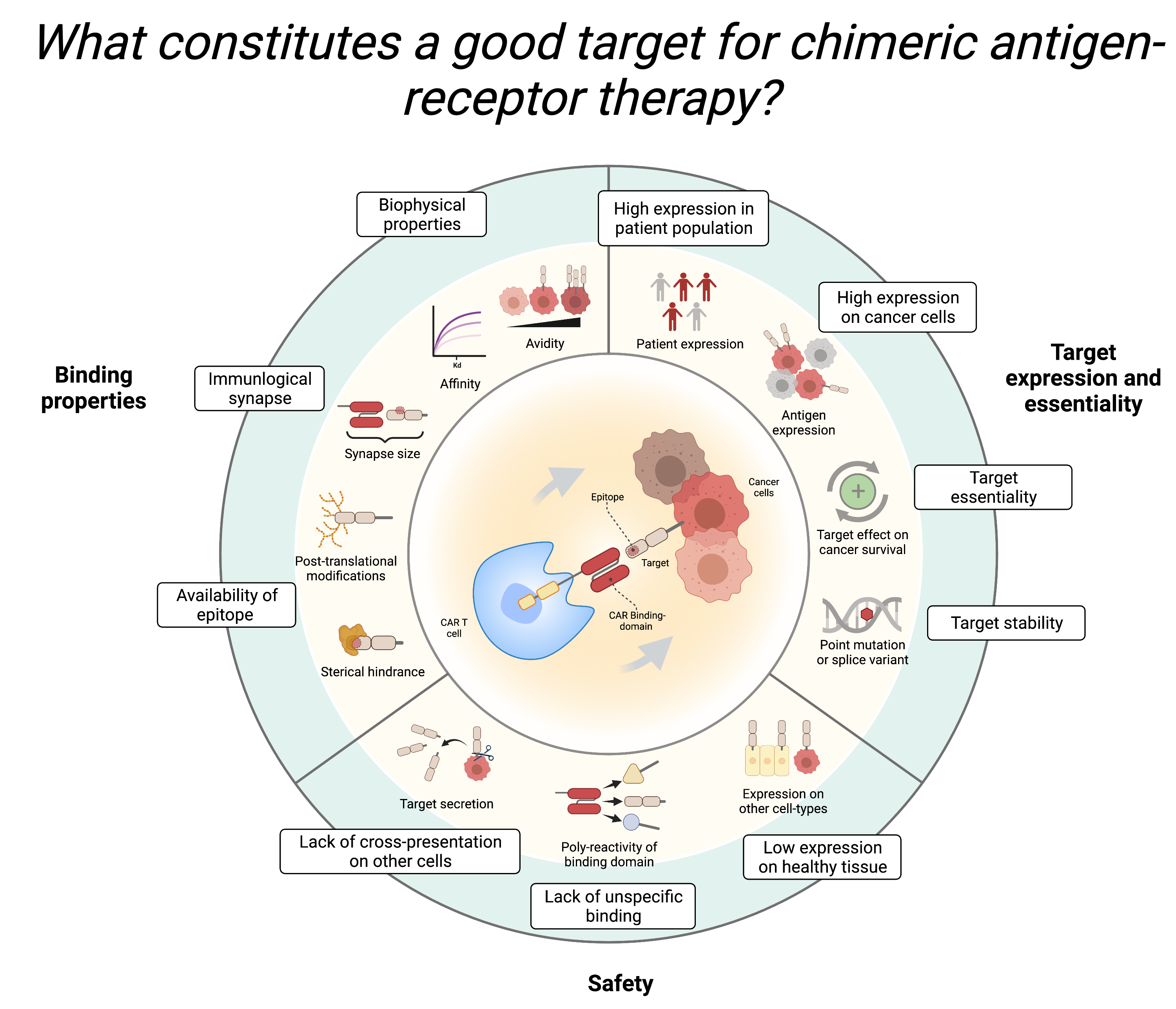
#### Course 22123: Computational precision medicine
#### Day 8 practical: Analysis of HER2 as a CAR Target
#### By Lasse Vedel Jørgensen
#### 29/10/2024
#### Technical University of Denmark

# Human Epidermal growth factor Receptor 2 (HER2) is a transmembrane tyrosine kinase receptor that plays a crucial role in cell growth, survival, and differentiation. Overexpression or amplification of the HER2 gene is linked to the development and progression of aggressive forms of cancer, particularly breast and gastric cancers. HER2-positive cancers tend to grow faster and are more likely to spread and recur, making HER2 both a significant biomarker and a therapeutic target.

# Chimeric Antigen Receptor (CAR) T-cell therapy is an innovative form of immunotherapy where a patient's T cells are genetically engineered to express CARs that recognize specific proteins on cancer cells. These modified T cells can directly target and kill cancer cells expressing the antigen. By designing CAR T cells to target proteins like HER2, we can potentially enhance the immune system's ability to eliminate HER2-positive cancer cells.

# In this exercise, you will analyze the HER2 protein to evaluate its suitability as a target for CAR T-cell therapy. You will use various bioinformatics tools and R for visualization and analysis.

# Task 1. Find the Sequence in SwissProt
# - Go to the UniProt database: https://www.uniprot.org/
# - Search for HER2 (also known as ERBB2).
# - Locate the human HER2 protein entry and download the sequence in FASTA format.

# Task 2. Run DeepLoc2
# - Visit the DeepLoc2 web server: https://services.healthtech.dtu.dk/service.php?DeepLoc-2.0
# - Upload the HER2 sequence.
# - Run DeepLoc2 with default settings. Before submission, check the “Instructions” and “Output format” tabs for help interpreting the output.
# Questions:
# - What is the predicted subcellular localization of HER2?
# - How confident is the model in its prediction?
# - What is the role of the signal peptide in relation to subcellular location?

# Task 3. Run DeepTMHMM and Visualize in R
# - Go to the DeepTMHMM web server: https://services.healthtech.dtu.dk/service.php?DeepTMHMM-1.0
# - Upload the HER2 sequence.
# - Run the analysis with default settings.
# - In R, use the provided script (Called “Script_for_topology_visualization.R”) to visualize the membrane topology by loading the “HER2_topology.RData” object and running the script.
# Questions:
# - Is HER2 a transmembrane protein?
# - What would happen if there were versions of the protein that were either truncated, mutated, or did not contain TM spanning region (secreted)?

Task 4. Run AlphaFold and Analyze the Structure<br>
- Visit the AlphaFold Server: https://alphafoldserver.com/ <br>
- Upload the fasta sequence for HER2.<br>
- Settings: Molecule  type = protein, Copies =1  <br>
- Submit the job (runtime is a few minutes). <br>
Questions:<br>
- Explore the result. Which parts of the Alphafold able to predict with high confidence? <br>
- Download the zip-file containing predicted 3D structures of HER2.<br>
Next, we want to visualize the structure and the topology of the predicted HER2 structure. <br>
- Go to https://www.rcsb.org/3d-view <br>
-   Choose one of the Crystallographic Information Files (CIF) (Alphafold made 5 predictions) and upload by Open files → Select files → Apply  <br>
-   Click the   icon and select the sequence that corresponds to the signal peptide, pick a color and apply it. Do the same for the ectodomain, the TM domain and the endodomain. <br>
Questions:<br>
-   How does the predicted structure correlate with the results from DeepTMHMM?<br>
<br>

Task 5. Retrieve Expression Data and Visualize in R<br>
- Explore https://gtexportal.org/home/ and https://www.cancer.gov/ccg/research/genome-sequencing/tcga <br>
- We have provided a dataset containing HER2 expression levels in diseased vs. healthy tissues. In R, use the provided script (Called “Script_for_expression_visualization.R”) to visualize the HER2 expression by loading the “HER2_expression.RData” object and running the script.<br>
- Visualize the expression of HER2 across different tissue origins. <br>
Questions:<br>
- What is TCGA? What is GTEx? <br>
- In which tissues are HER2 overexpressed? <br>
- From the RNA expression, can we say something about the relevance of HER2 as a therapeutic target?<br>
<br>

Task 6. Evaluate HER2 as a Good Target<br>
-   Discuss with your peers:<br>
-   What factors should be considered when selecting a target for CAR T-cell therapy? <br>
-   Based on your findings, is HER2 a good candidate for CAR T-cell therapy?<br>
<br>When: November 5, 13.00-17.00
Where: Building 210, room 142/148
What: Follow-up on exercises, Q&A, Lecture, exercises, and self study